Today's consumers don't just choose beverages based on caffeine, flavor, or function. They choose products that reflect their lifestyle, values, and personal identity.
What we drink influences how we feel, but it also communicates something more powerful. What you drink tells the world who you are, and what you care about.
Lotus was built around a simple belief: A beverage is an accessory; it should be intentional, stylish, expressive, and deliver on its promise of efficacy. By combining plant-powered ingredients, premium design, and the iconic Lotus philosophy of Life in Balance, Lotus has created more than a beverage. It has created an identity.
That belief became the foundation for everything that followed.
For decades, the energy drink category has been built around speed, stimulation, and performance. Consumers were trained to choose products based on caffeine content, flavor names, or the promise of getting through the next workout, shift, study session, or long day.
Lotus saw an opportunity to approach energy differently.
As consumer preferences evolve, people are becoming more intentional about what they put into their bodies. They read labels more closely. They look for ingredients they can feel good about. They want products that reflect their lifestyle.
That shift has helped create a new era of energy: one that incorporates better ingredients, better taste, and projects a more personal relationship with what fuels us.
Lotus was built for that future.
At the center of every Lotus Plant Power drink is Plant Power 7™ (PP7™), the brand's proprietary blend of certified organic plant-based ingredients. The formula brings together functional botanicals including green coffee beans, guayusa, green tea extract, coffee fruit, elderberry, Jerusalem artichoke, and ashwagandha KSM-66.
The brand also understood something equally important: better ingredients only matter if people actually want to drink the product.
Consumers don't just want clean labels. They want products that fit their lifestyle, reflect their identity, and create an experience they enjoy returning to.
That is why Lotus was designed to deliver more than functional energy.
Many consumers have come to refer to it as the Lotus Glow™, the idea that energy is more than a feeling. It is reflected in how people connect, create, move, and express themselves throughout the day.
For Lotus, the ingredients create the foundation. The energy experience creates the glow.
More Than a Flavor. A Form of Expression
The timeless philosophy of the lotus flower is not just the foundation, but became the inspiration for everything that followed, including the brand's distinctive color-driven packaging system built around personal expression, individuality, and choice.
Most beverage brands build packaging around specific flavors. One can is watermelon. Another is cherry lime. Another is tropical citrus. The flavor becomes the identity.
Lotus took a different approach.
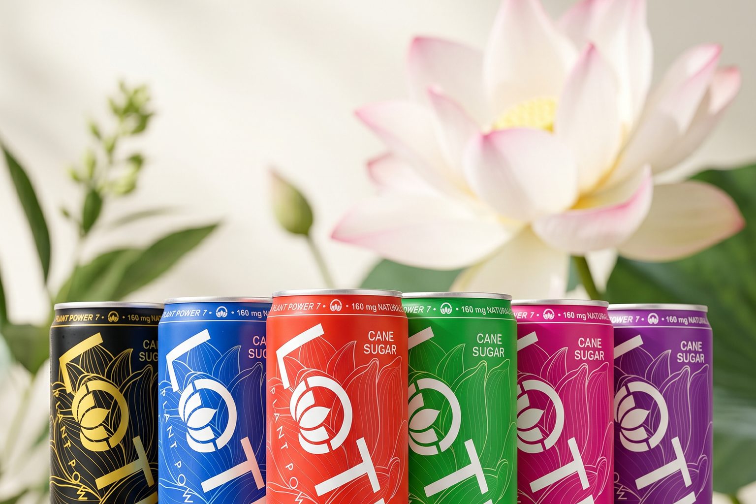
The brand's colors are not treated as temporary flavor labels. They are treated as part of a larger visual language. Pink Lotus. Blue Lotus. Green Lotus. Red Lotus. Purple Lotus. Gold Lotus.
Each color becomes instantly recognizable while still giving consumers room to decide what it means to them.
For one person, Pink Lotus may feel bright, expressive, and fun. For another, it may simply be the color they are drawn to that day. Blue may feel refreshing to one consumer and powerful to another.
The interpretation belongs to the individual. And that is exactly the point.
Lotus is built around the belief that energy is personal. What people drink can reflect how they live, how they create, how they connect, and how they show up in the world.
Where Color Meets Meaning
The color philosophy behind Lotus is rooted in the symbolism of the lotus flower itself.
The lotus flower has long been associated with balance, vitality, and growth. Those qualities continue to inspire the Lotus brand today, influencing everything from product formulation to the vibrant color system that defines the portfolio.
That same philosophy influences the way Lotus thinks about color.
The brand draws inspiration from the relationship between color, energy, and self-expression, while keeping the consumer experience modern, accessible, and mainstream. The result is a packaging system that feels vibrant and expressive without becoming overly complicated.
Rather than creating a completely different visual identity for every flavor, Lotus built a consistent packaging architecture that allows color to become the hero.
In a category where packaging often changes dramatically with every flavor launch, Lotus has created a more enduring system.
The approach has resonated not only with consumers but with industry leaders as well, earning recognition for packaging design and shelf presence within one of the most competitive categories in beverage.
Packaging That Creates Identity
Great packaging does more than communicate information. It creates an identity.
Lotus was designed to deliver a premium beverage experience, something a consumer wants to hold, photograph, carry, and identify with. Making each can feel like an accessory.
The goal is not just to stand out. The goal is to evoke curiosity.
Packaging Drives Trial. Identity Builds Brands.
The future of energy is not simply about more caffeine. It's about a direct relationship with the consumer that projects their image and values.
By combining PP7™ with a color-driven packaging system, Lotus connects what is inside the can with how people express themselves on the outside.
By designing energy around color, plant-powered ingredients, personal expression, and a philosophy centered on life in balance, Lotus has created something increasingly rare in the beverage aisle: a beverage accessory that looks and feels as intentional as the people who choose it.
.png)