The Shelf Play
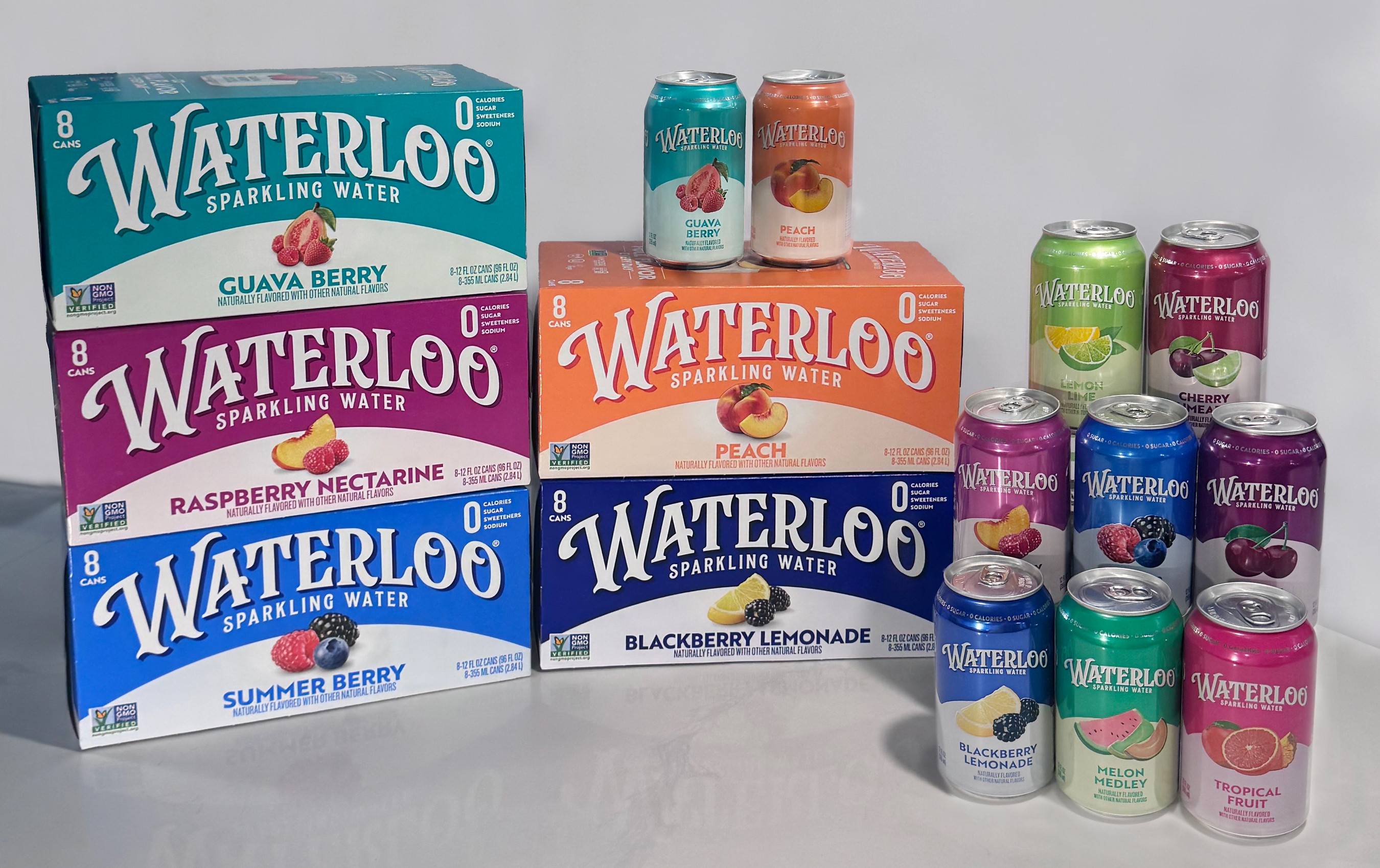
Waterloo Sparkling Water is rolling out a full portfolio packaging redesign — its first since the Austin-based brand launched in 2017 — as the independently owned sparkling water supplier looks to convert category momentum into durable retail shelf performance. The refreshed carton and can graphics are now appearing across all pack sizes at national retailers, timed to a period of what the company describes as 3X category growth and a 17% lift in household penetration during the first half of 2026.
Developed with brand agency CBX, the new design trades subtlety for saturated color, stronger flavor cues, and a modernized wordmark — all calibrated to improve stopping power on planograms in an increasingly crowded non-alc set. Eye-tracking studies and multiple rounds of consumer testing informed the final creative direction, with the winning concept chosen for its brand recognition and flavor findability scores at shelf.
Why Packaging Is a Distribution Lever
For a supplier competing in the off-premise sparkling water category — where LaCroix, Spindrift, and private label SKUs compete for end-cap and cold-vault real estate — packaging legibility is a tangible commercial asset, not merely a marketing exercise. Retail buyers and wholesaler sales teams rely on clear visual differentiation when presenting planogram resets, and flavor-coded color architecture directly affects how efficiently a depletions-driven brand turns inventory at retail. Kathy Maurella, Chief Marketing Officer at Waterloo Sparkling Water, framed the redesign squarely in distribution terms: the goal is to make the portfolio easier to discover and shop across all consumer touchpoints as the brand works to expand its household reach.
Mark Christou, Principal and Chief Creative Officer at CBX, noted that shelf blur is a real liability in the segment. "The sparkling water category is more saturated than ever, and most brands are starting to blur together on shelf," he said. "This packaging refresh sharpens that story, giving the brand a more vivid, recognizable identity." For distributors managing a broad non-alc book, sharper visual differentiation reduces the friction of floor-level sell-in to retail category managers.
What's Next
The packaging rollout is accompanied by a relaunched e-commerce-enabled website at drinkwaterloo.com, designed with improved shoppability — a nod to the growing DTC and ship-to-home channel for non-alc beverages, even as the brand's primary volume moves through the traditional retail supply chain. The product formulations remain unchanged: all SKUs are built on Non-GMO Project Verified natural flavors with purified carbonated water, zero sugar, and zero sweeteners, preserving the clean-label positioning that has driven retailer adoption. For trade buyers evaluating the sparkling water shelf in the back half of 2026, Waterloo's redesign signals a supplier investing in the category rather than managing decline — a meaningful signal as retailers rationalize non-alc SKU counts heading into annual planogram resets.
For more on non-alc supply-chain dynamics, see our coverage of emerging non-alc distribution trends and retail shelf strategy in functional beverages.
Written by Michael Politz, Author of Guide to Restaurant Success: The Proven Process for Starting Any Restaurant Business From Scratch to Success (ISBN: 978-1-119-66896-1), Founder of Food & Beverage Magazine, the leading online magazine and resource in the industry. Designer of the Bluetooth logo and recognized in Entrepreneur Magazine's "Top 40 Under 40" for founding American Wholesale Floral, Politz is also the Co-founder of the Proof Awards and the CPG Awards and a partner in numerous consumer brands across the food and beverage sector.
.png)